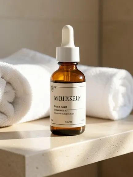
The exact requestSpa shelf with towels Do not add any text, label or logo that is not already on the product.
Try it on your own photo in Skincare Photos →Before and after
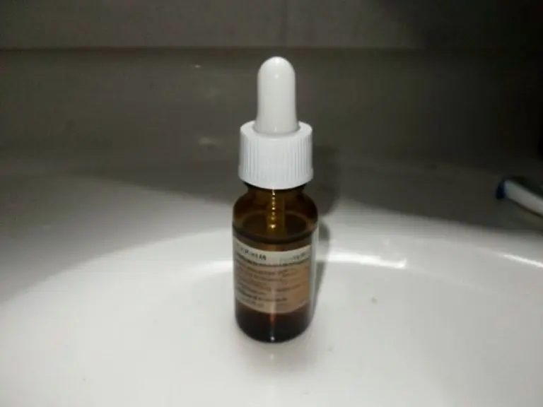
An amber dropper bottle beside a toothbrush on a bathroom sink, then the same bottle on a soft spa shelf. This is one real run of our skincare photo tool, with the odd parts left in.
Made 21 October 2026
The exact requestSpa shelf with towels Do not add any text, label or logo that is not already on the product.
Try it on your own photo in Skincare Photos →The before photo is a phone-style snapshot of a generic product that we made with an AI image model for this page; it is not a customer photo. The after is the unedited result of our own free tool on that photo, made on 21 October 2026 at the size a visitor gets and shown without the download mark. One run, one result: yours will differ.
A bathroom sink is where people actually keep their serum, and that is the problem. White porcelain turns the bottle into a dark shape against a bright wash, the overhead bulb flattens the glass, and the toothbrush tells the buyer where the photo was taken.
The label was the other issue. Overhead light bounced off the glass and left the label a gray smear, so even a patient shopper could not tell what the product was.
We asked for a spa shelf with towels. The bottle stayed amber with the same white dropper top, but it now stands on a pale stone ledge with a pair of rolled white towels beside it and a soft glow from one side. The sink, toothbrush and glare are gone.
The picture also came back as a tall frame rather than the wide shape of the original. That suits a bottle, and it is why the page shows it at full height instead of cropping it. A tall image is easy to drop into a product page, but check how your store crops it.
The label now looks sharp, and that is the trap. In the original it was unreadable, so the model filled it in with something that looks like a brand name and a few lines of small print. None of it is real. A serum label carries the product name, the volume and often a use or ingredient line, and a buyer will read exactly those words.
A calm shelf with soft towels says gentle and clean, which fits serums, oils and toners well. It is less right for a clinical product, where a plain white background reads as more trustworthy. The same tool set also makes that version.
Free tools for this
FAQ
Our tools are written to keep the product as it is, including printed text. Small print can still blur or change, so read the result against your packaging every time.
In this run the model returned a tall frame that suits a standing bottle. Results vary from photo to photo, so yours may keep the original shape.
Be careful. Any wording on the label or in the picture that implies results or claims has to match the real product, so check it yourself.
No. It is a phone-style snapshot of a generic bottle that we made with an AI image model for this page.
Z Product AI makes the tools shown here. Third-party pages above were read for general background on what to check in AI product photos as of 21 October 2026.